letters between us
2017–Ongoing
Print series
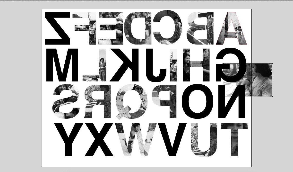
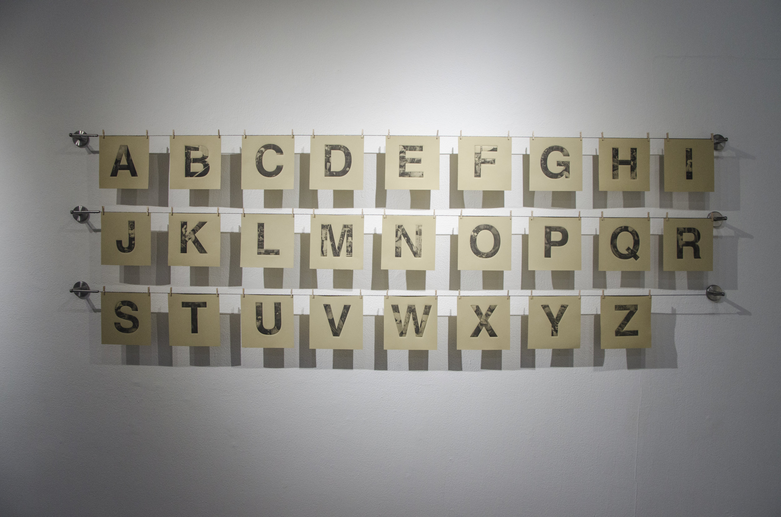
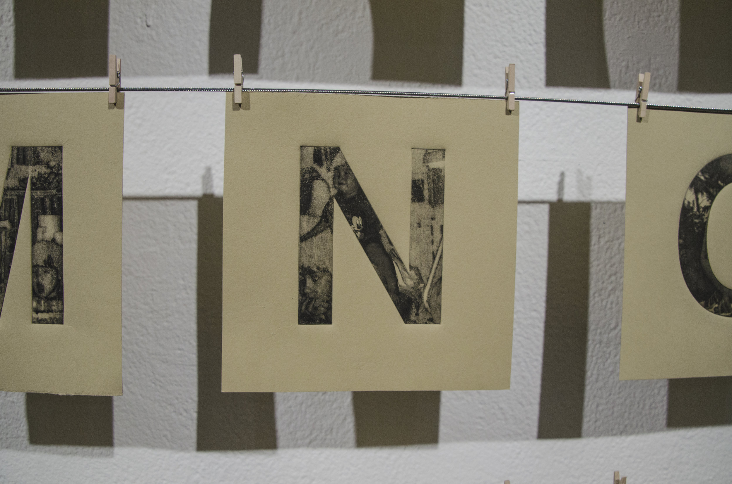
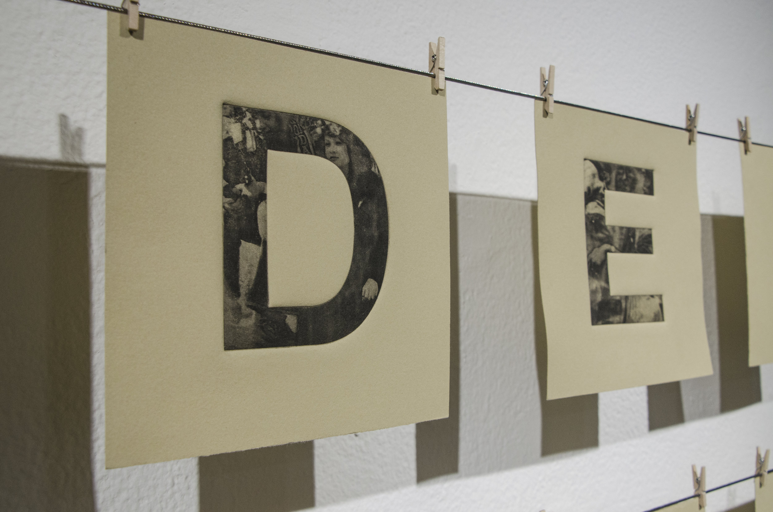
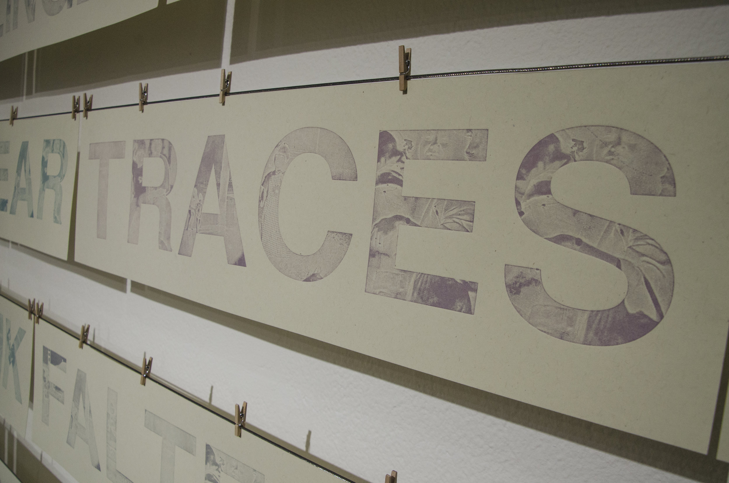
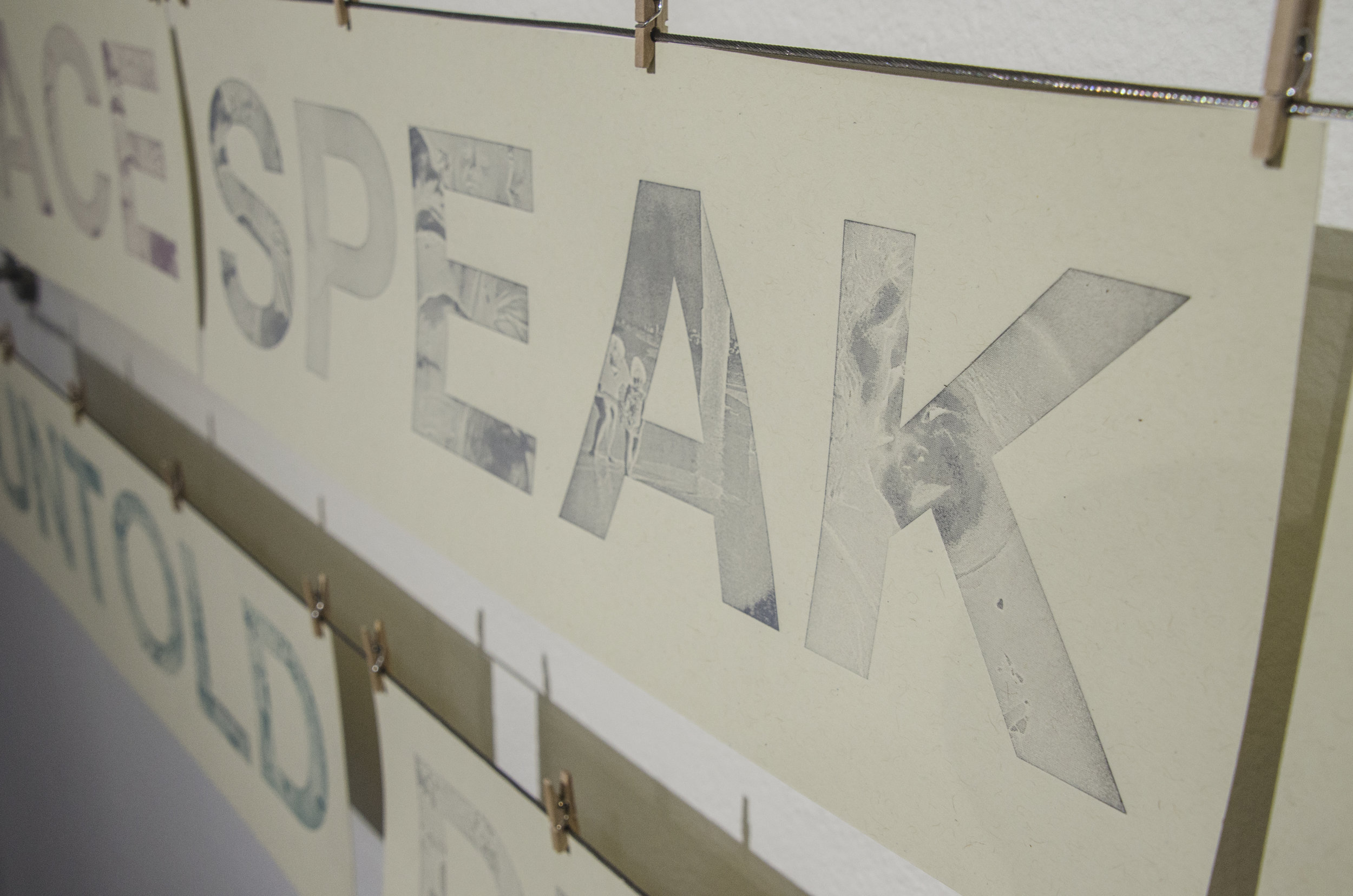
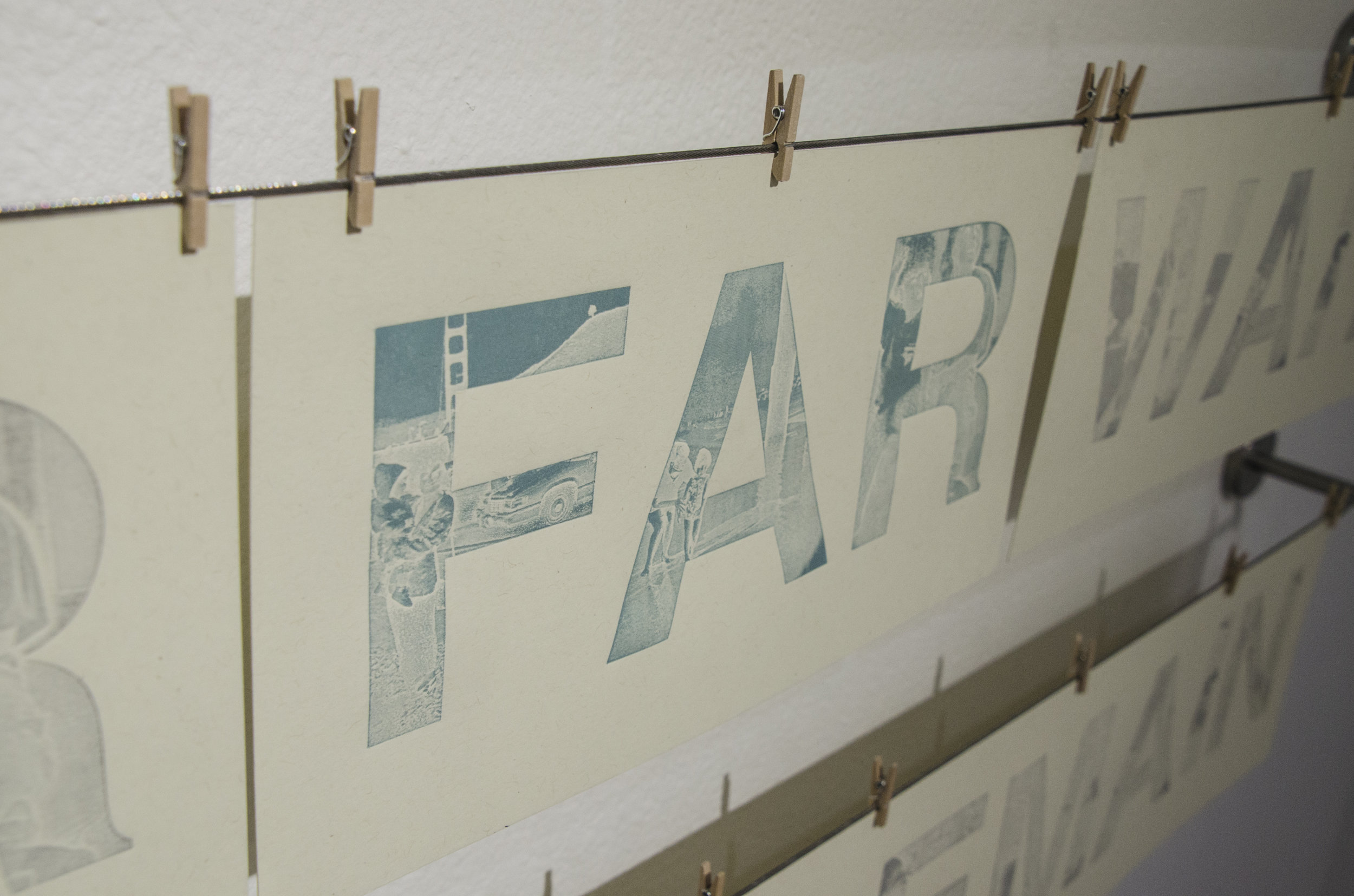
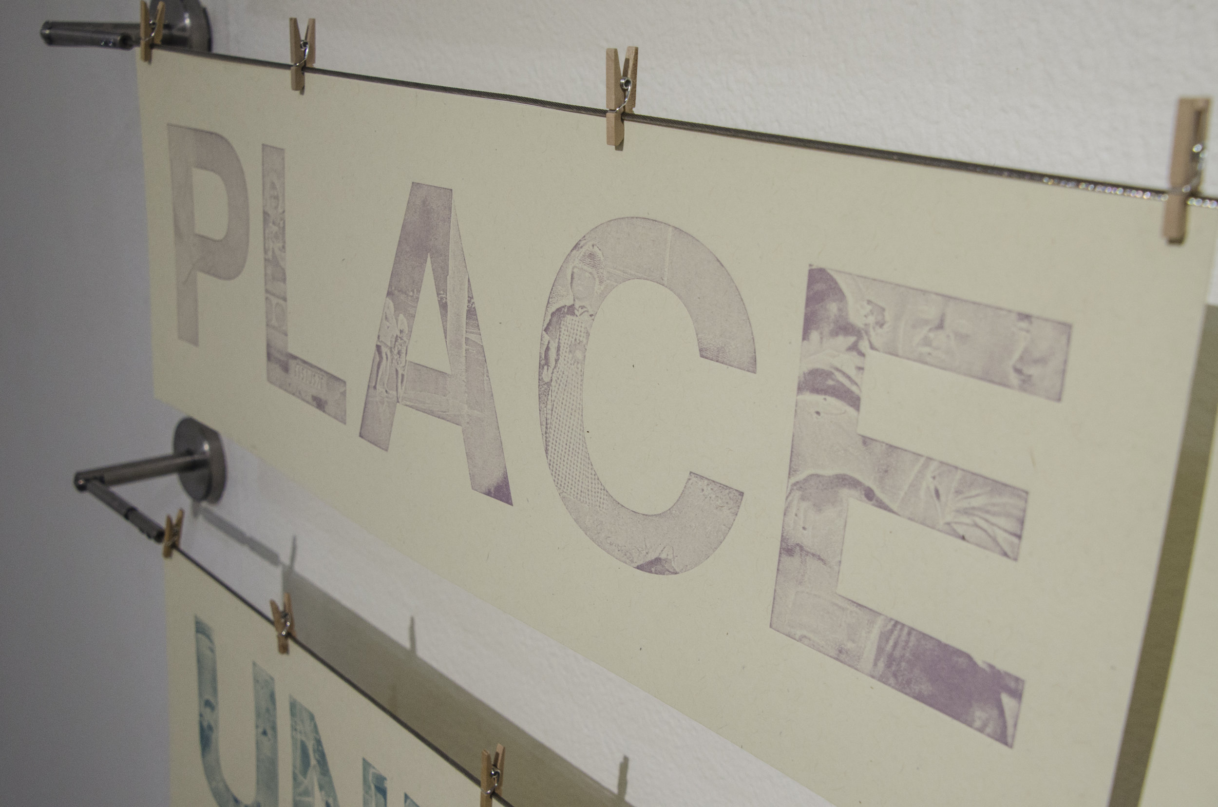
This print series was inspired by old photographs of my mother, who passed away when I was four years old. Struggling to find language to describe my relationship to someone I should be close to, I wanted to explore a way to process and “write” our relationship into existence.
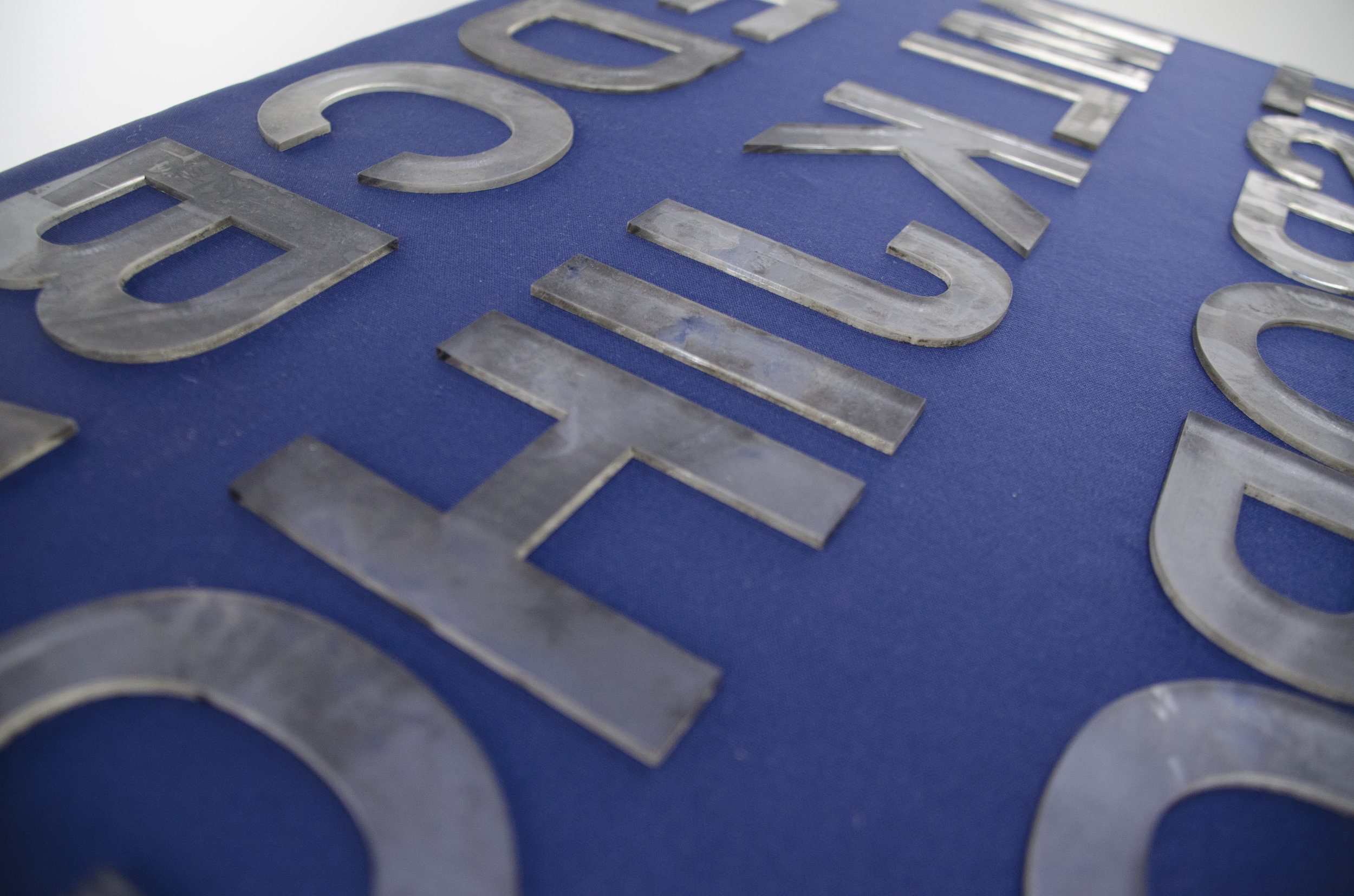
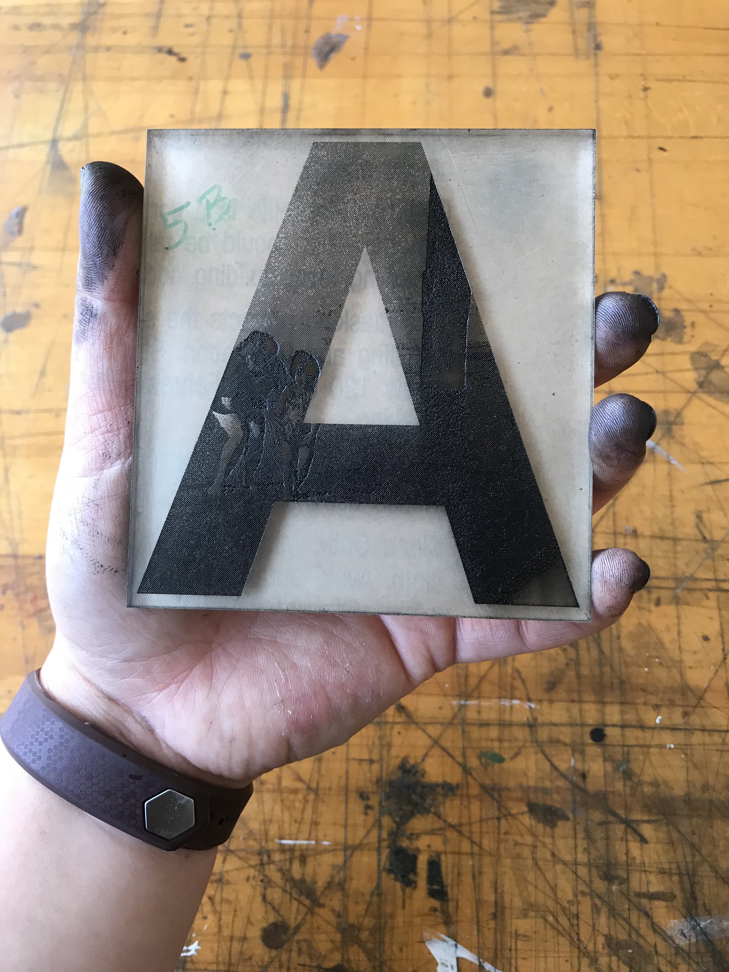
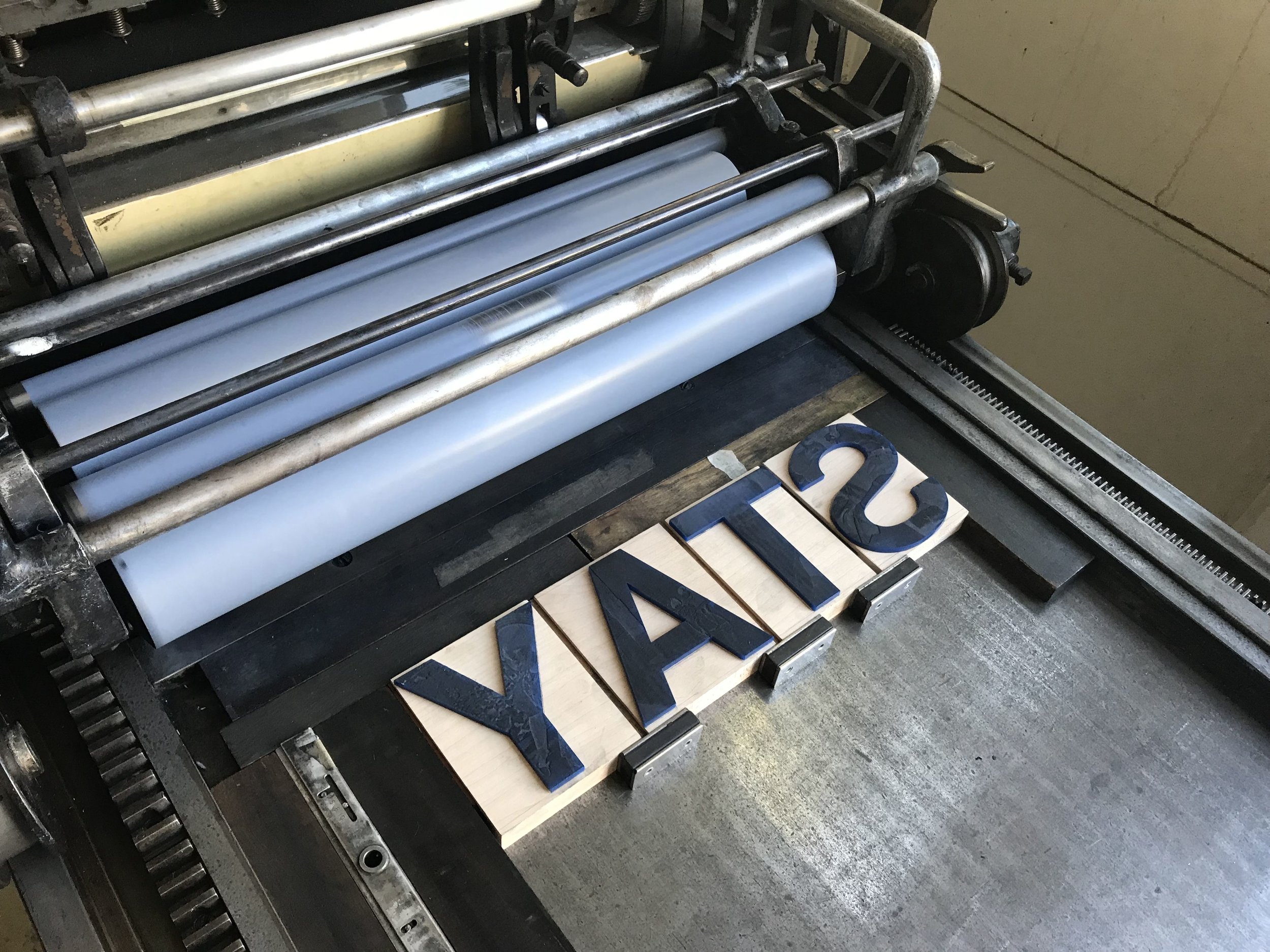
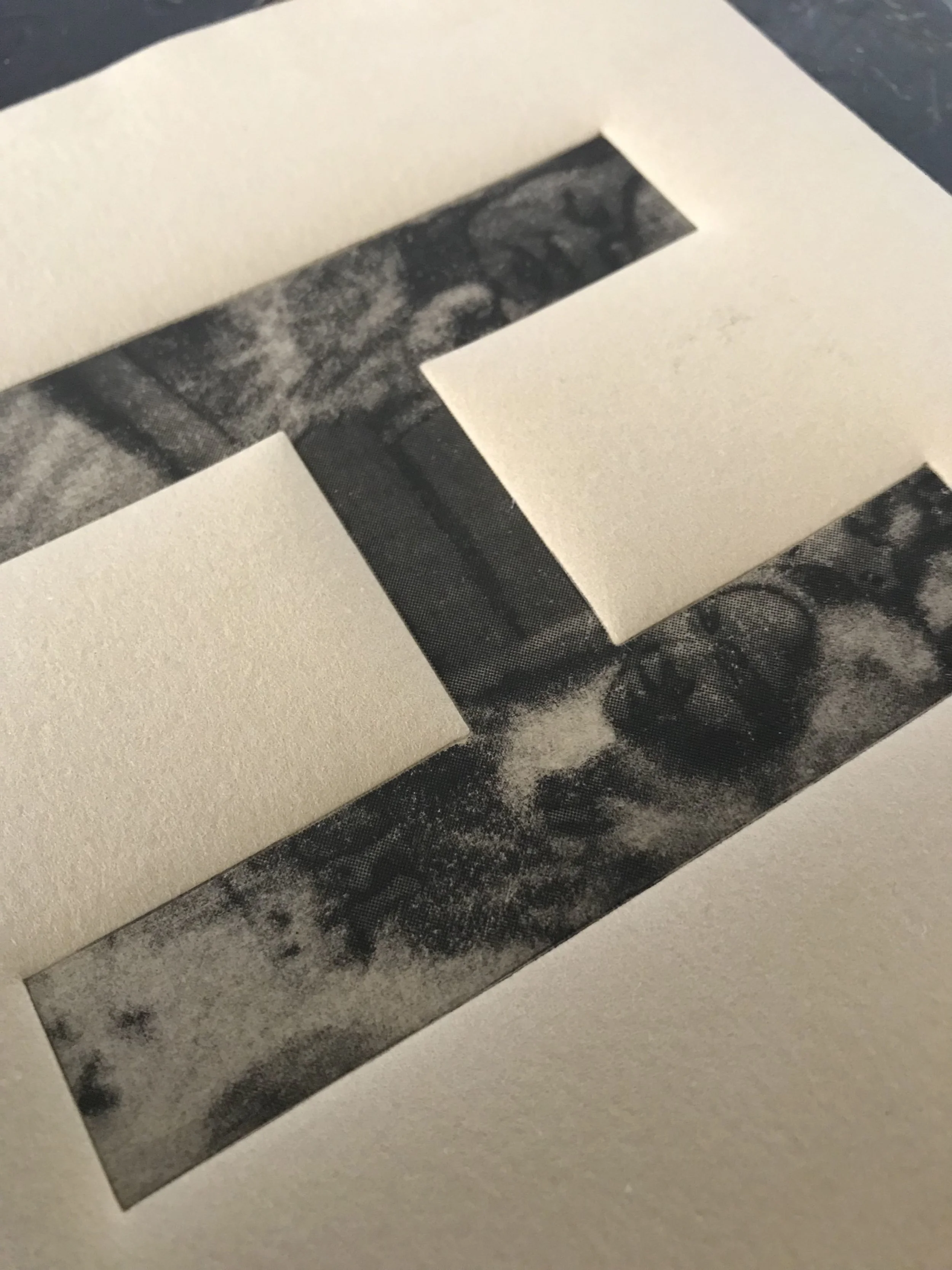
Thinking about this difficulty of words, I masked these old photos of her and us together into letterforms. I specifically chose to utilize the typeface Helvetica, which was designed as a modern typeface in the 20th century for its legibility and neutrality, though it has become co-opted as the look of capital culture today. Wanting to destabilize this look of corporatization and neutrality with intimately human material, this juxtaposition inspired me to investigate the imagery of these letterforms through printing.
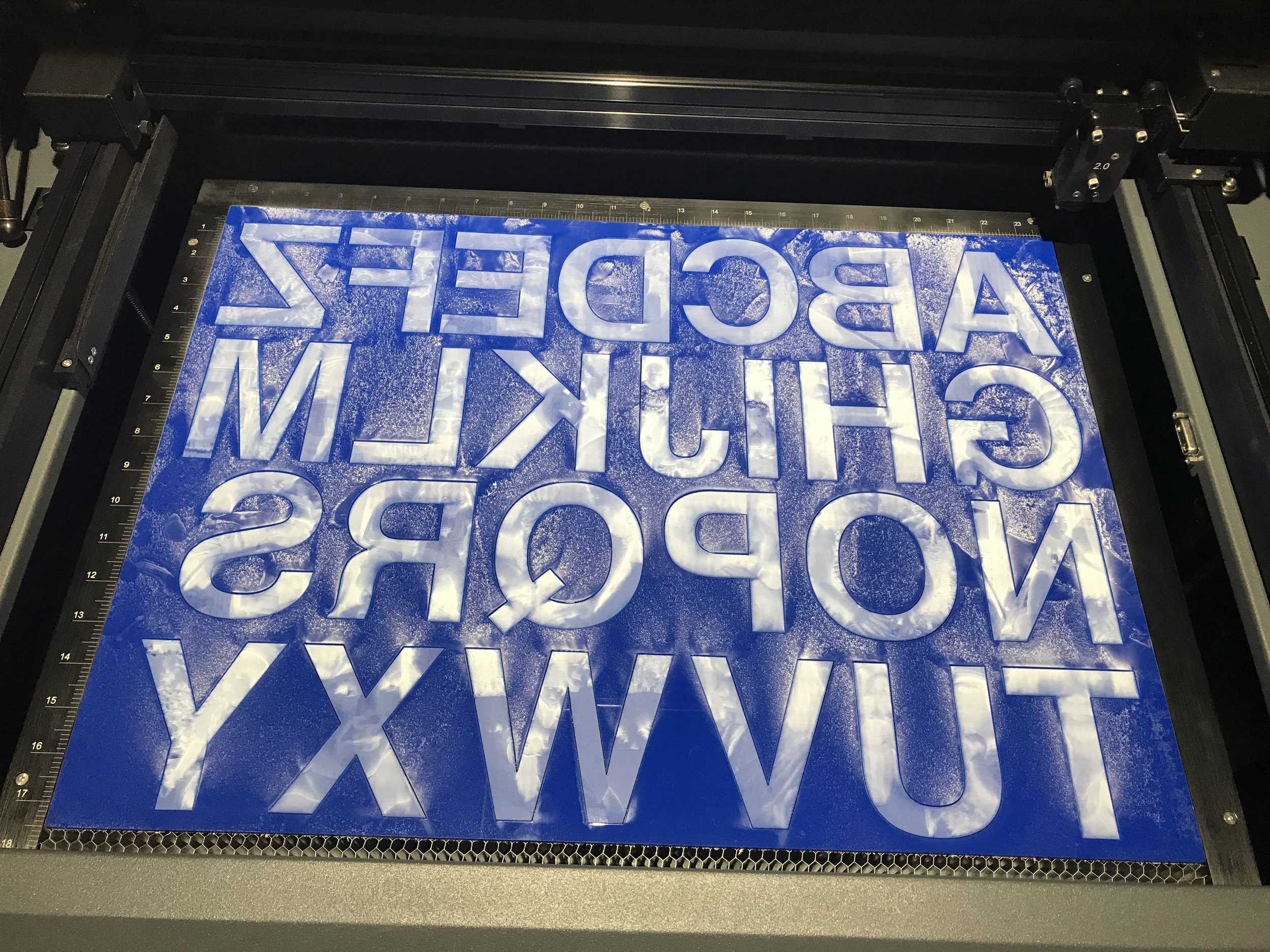
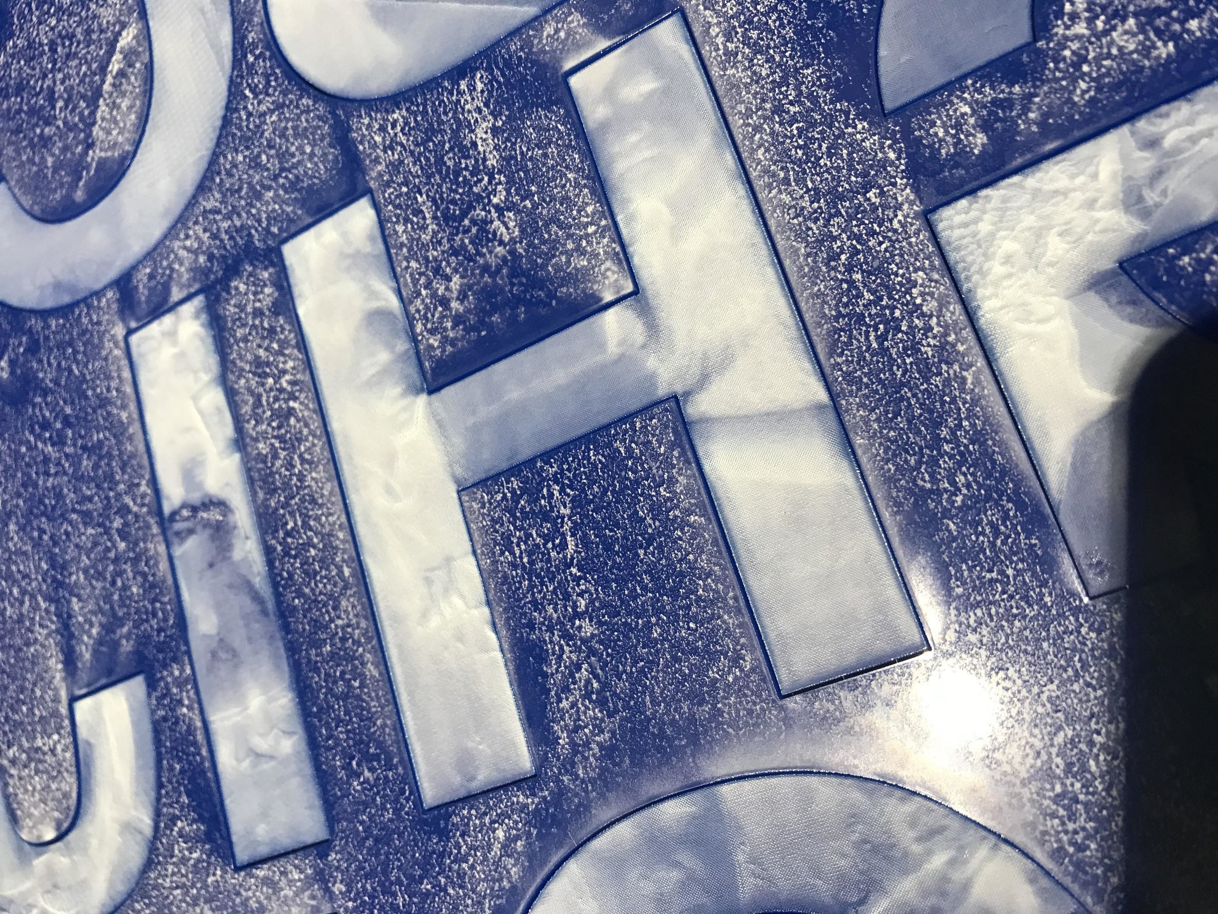
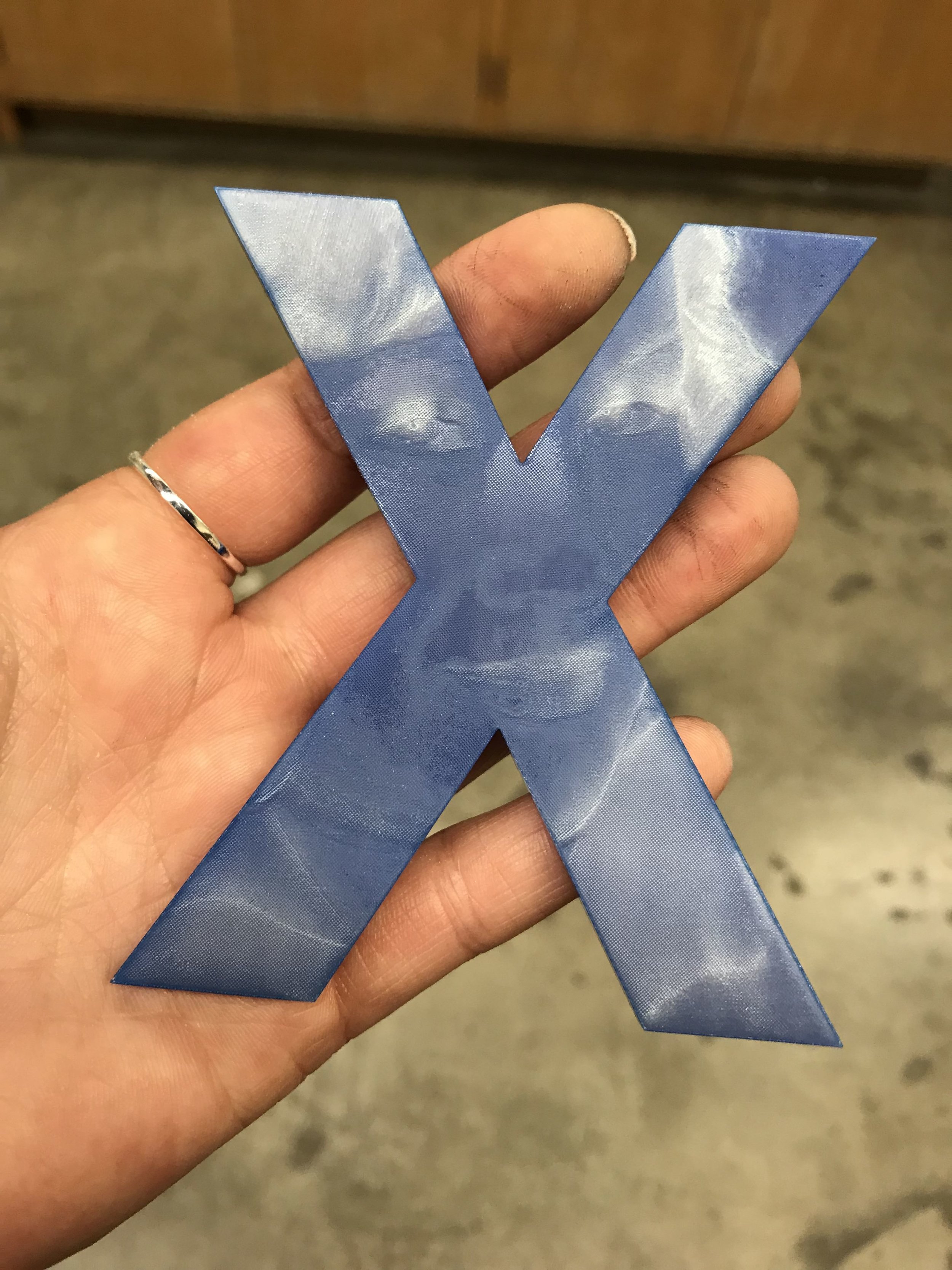
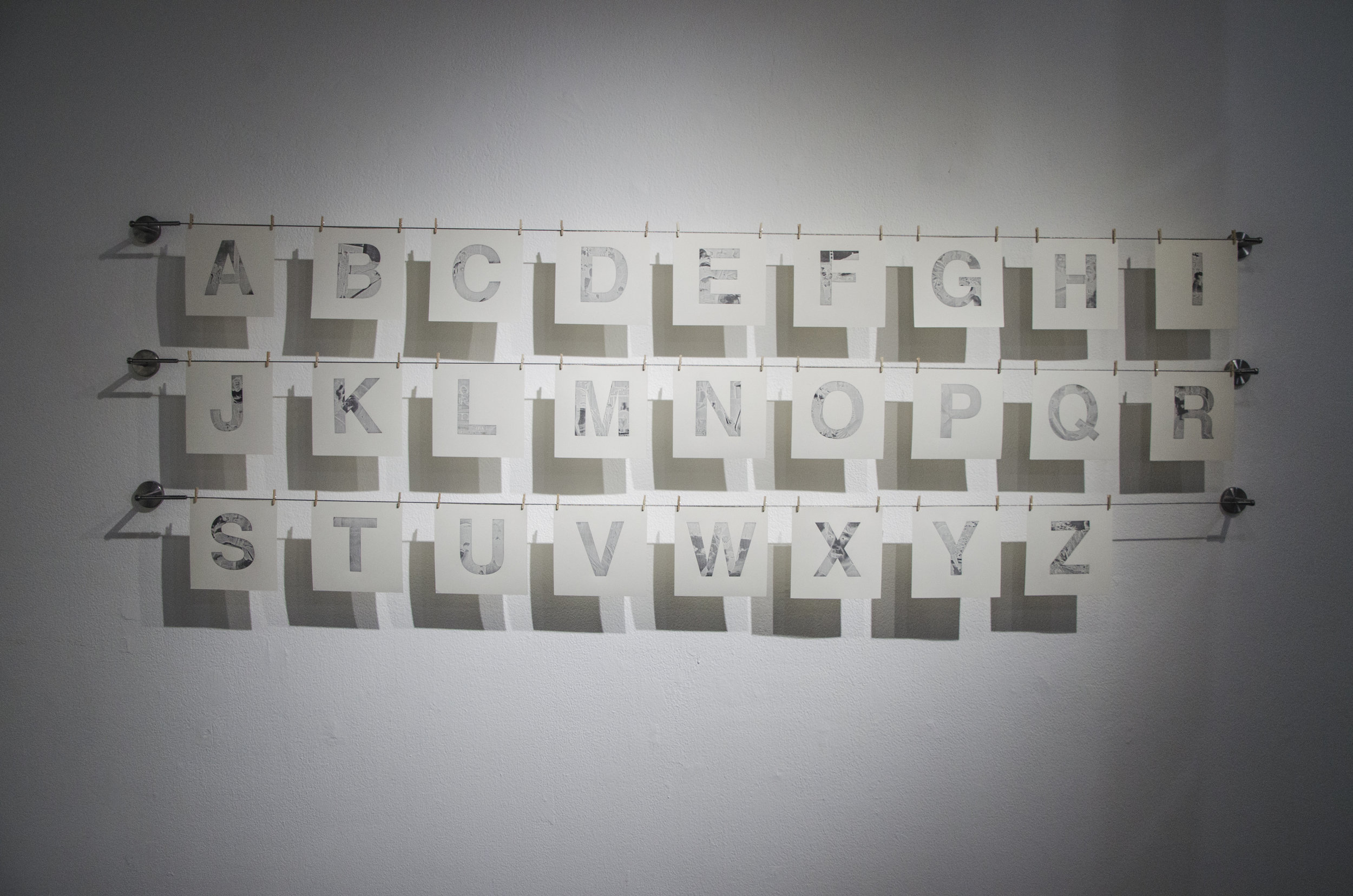
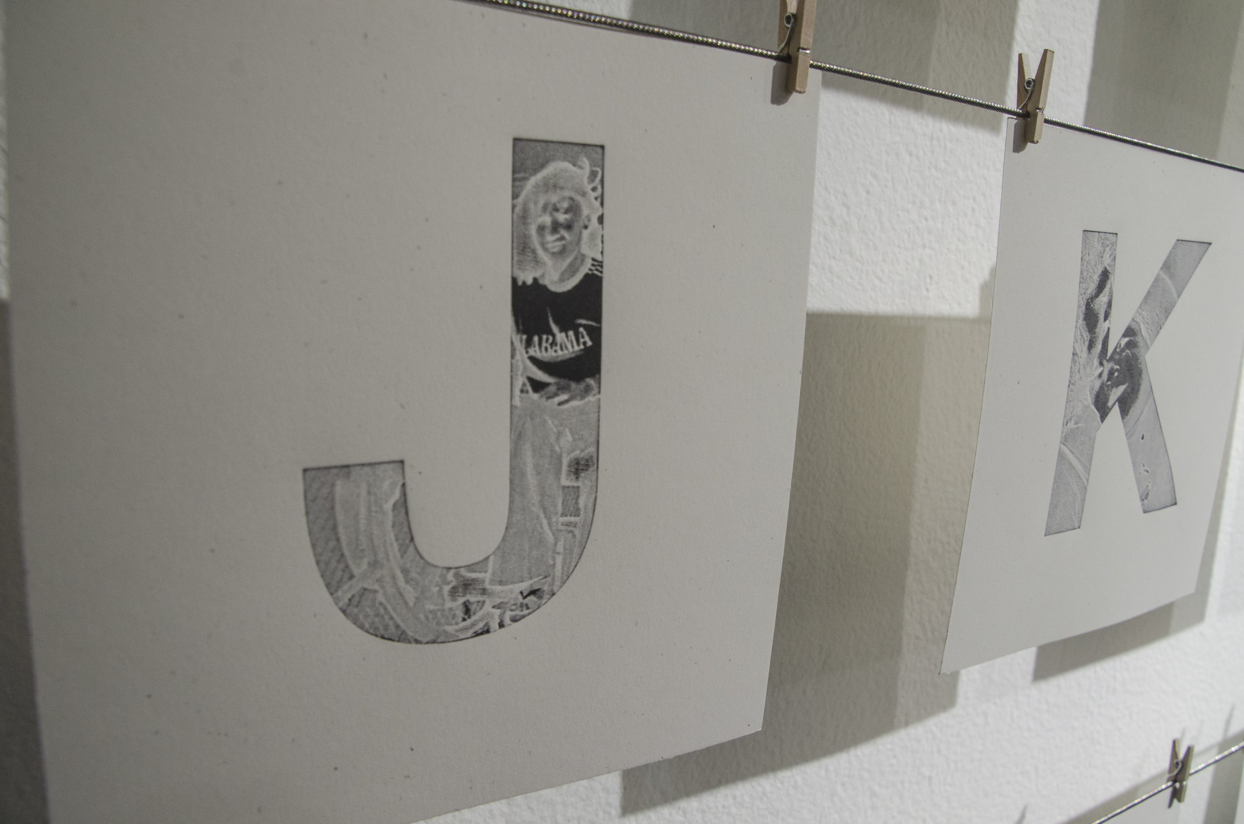
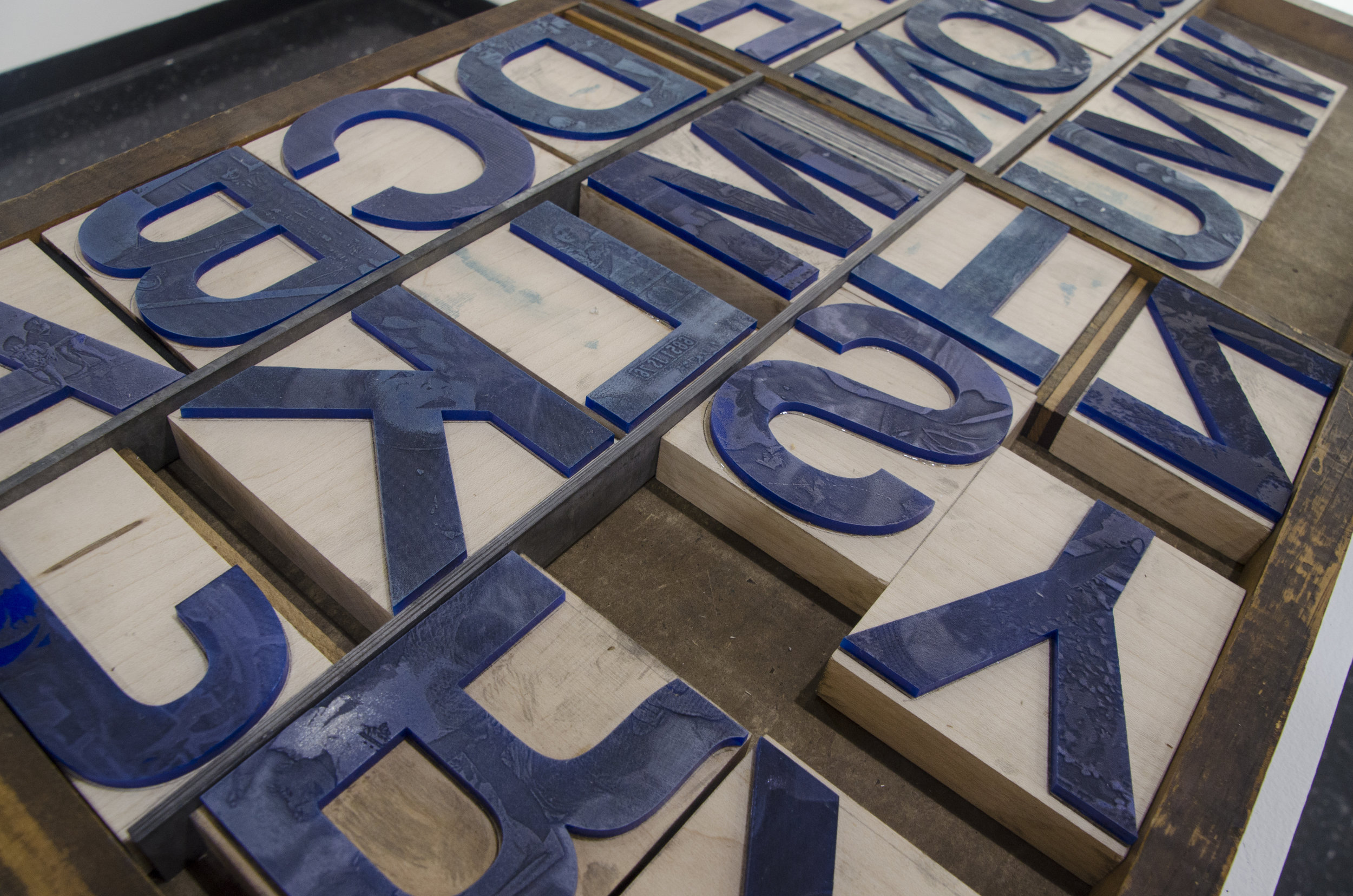
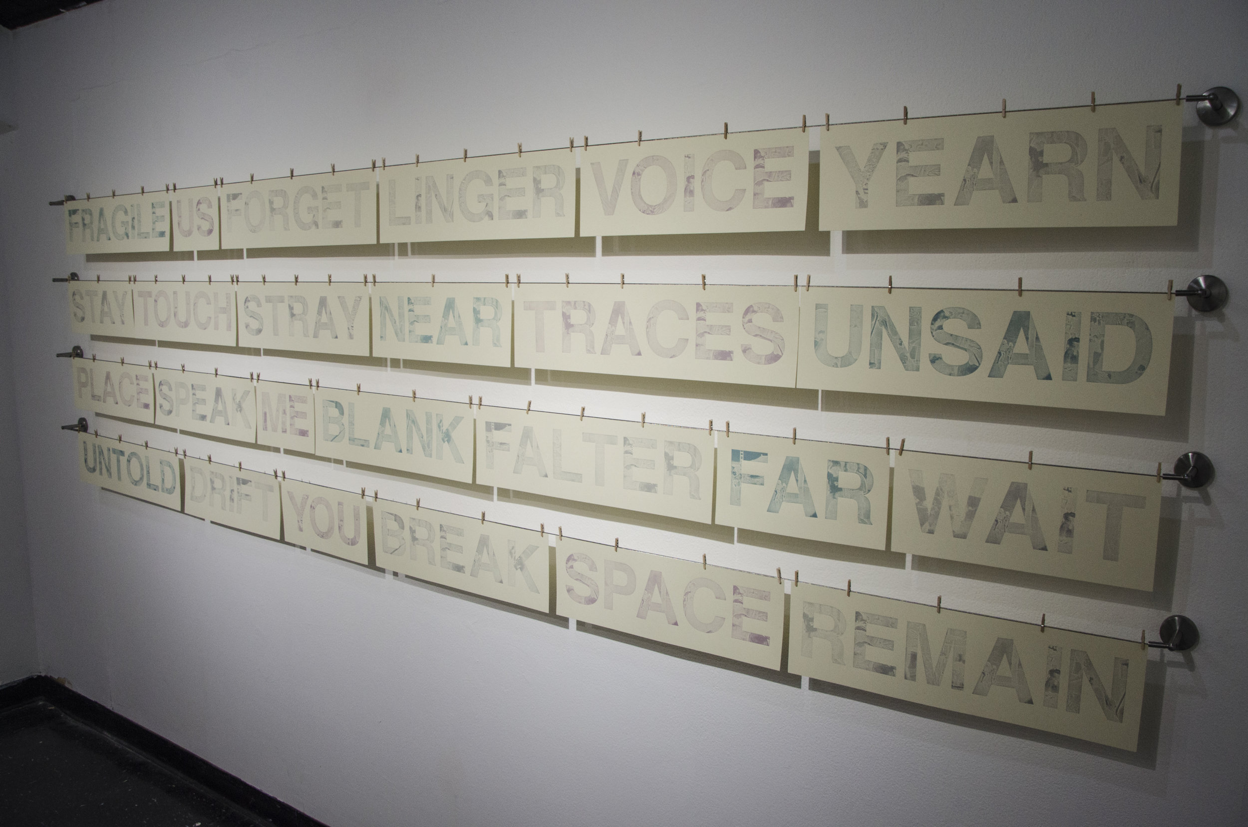
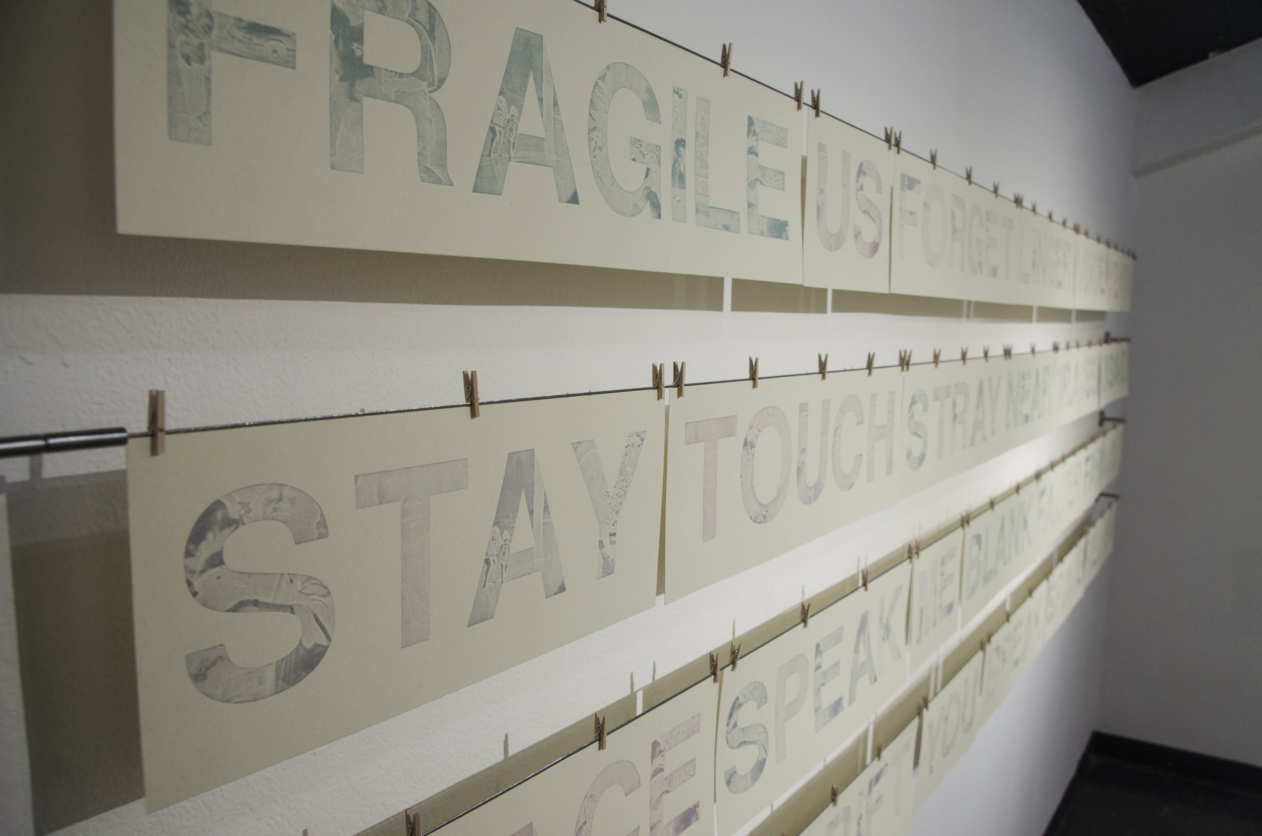
The letterforms I designed were fabricated onto acrylic, slowly laser-etched with the photos I masked within. These forms were then mounted type-high onto wood to create my own movable type of the design. These ghost-like prints are part of a large series that consists of language related to loss, longing, and the struggle to articulate.
Below are process photos of my creations. I printed one set of A-Z by hand in the intaglio process, and another set through letterpress.